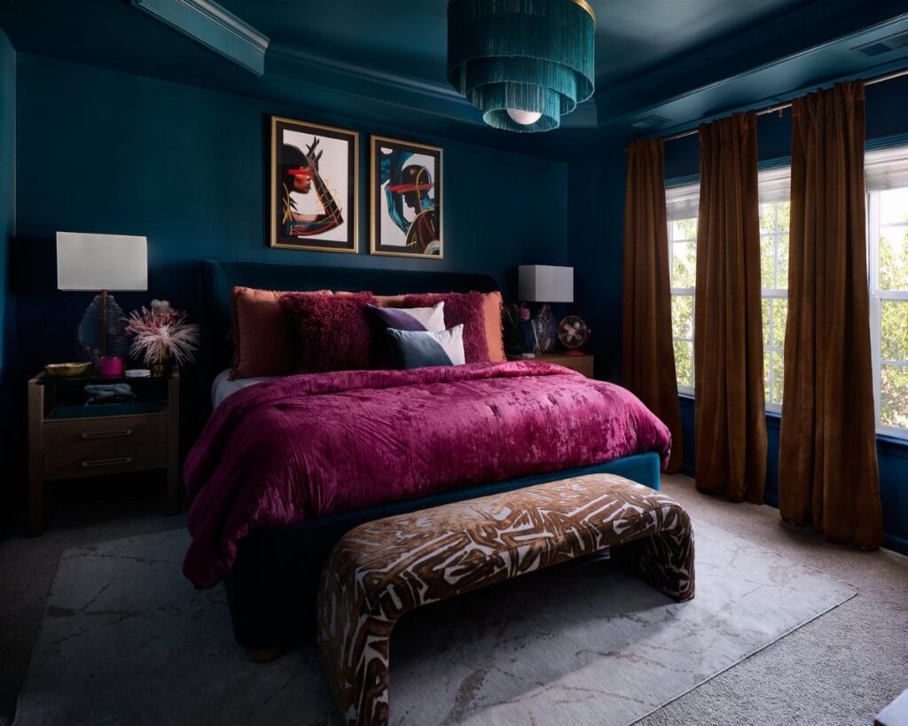
Light decides how any of these colors will read, so check which way your windows face, what the floor is, and which lamps you switch on at night.
Dark choices like a black ceiling need extra coats, so brush a sample patch next to your bedding before you commit.
1. Soft Neutrals
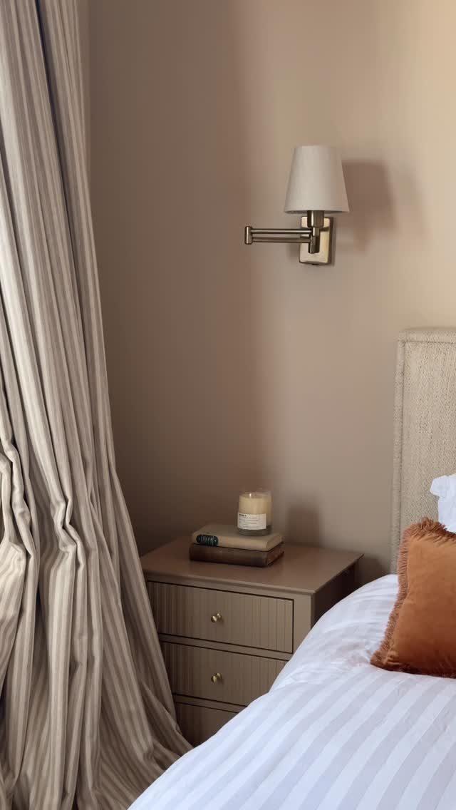
One warm accent against white striped linens keeps the room calm without going flat.
Matching the curtain to the wall color makes the corner read as one soft block, which suits a compact bedroom.
I’d pick a beige with a touch of warmth over a gray-leaning one, then test a sample patch beside your bedding before committing.
2. Bold Jewel Tones
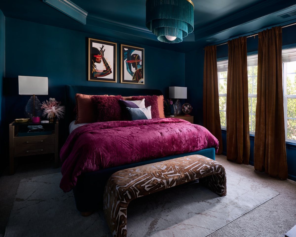
Jewel tones work best in pairs: one cool, one hot, with something brown or gray to settle the eye.
Here the brown curtains and gray rug do that job.
Sample the teal on 2 walls first, since it shifts with the light.
3. Light Blue Paint
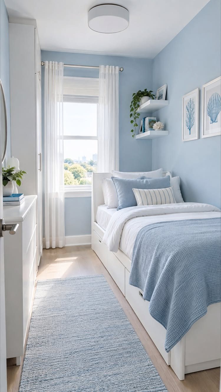
Light blue paint pairs best with white furniture, and a compact bedroom gets a clean, airy look from it. Repeating the blue in a rug and bedding ties everything together.
I’d keep the bedding a shade or two deeper than the walls so the bed doesn’t vanish into them. White curtains finish the look without adding another color to think about.
Paint is the cheap part here, so spend the rest on layered blues.
4. Olive and Sage Green
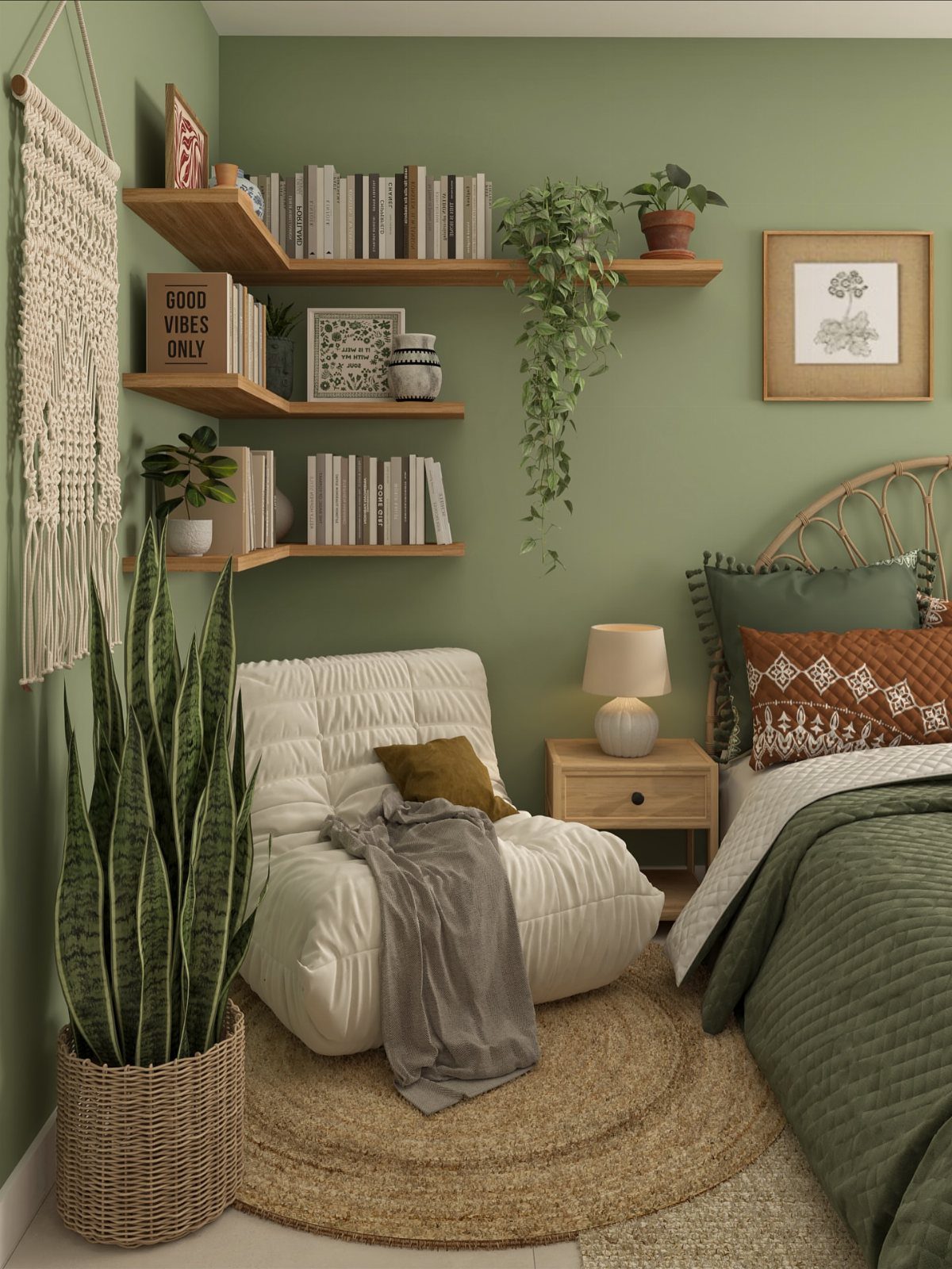
Sage green does the quiet work of making plants look like part of the plan. Wooden shelves and a few pots against it feel natural, and white seating keeps the green from getting heavy.
Olive is the deeper cousin, so choose it for a bigger or brighter room. Sage suits smaller spaces better.
For a weekend project, paint one coat of sample on a wall and look at it morning and night before buying gallons.
5. Sunny Yellow
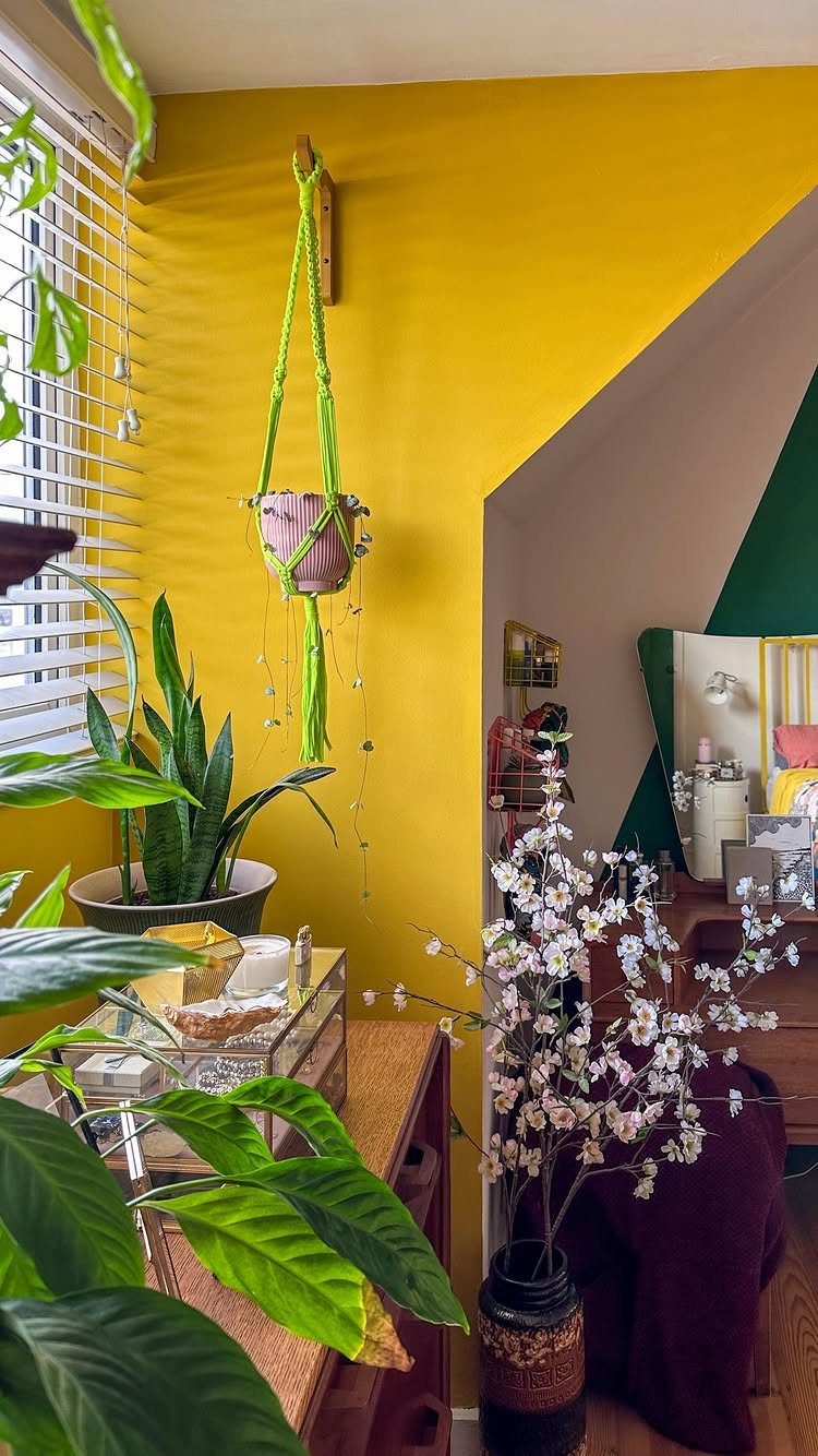
A single yellow wall can wake up a corner, especially with green houseplants and white flowers beside it. The green leaves calm the brightness, which is why I like this pairing over yellow alone.
The maker of this corner mentioned using more than 1 paint shade, so expect to test a few yellows before one looks right. Go for a softer, buttery tone if you want a bedroom to still feel restful.
6. Chocolate Brown
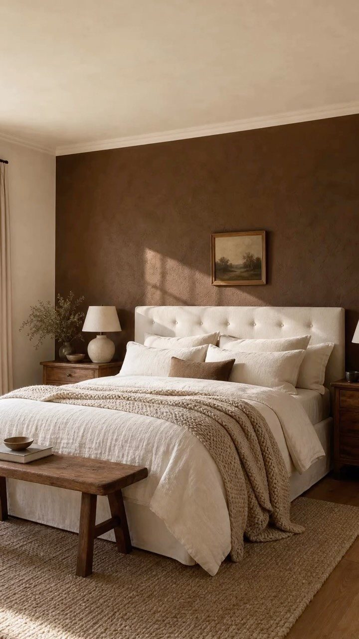
Pair chocolate brown walls with a white upholstered bed for high-contrast cozy; the pale headboard keeps the dark color from closing in like a cave. Wooden nightstands and a bench add to the warmth.
2 things decide whether brown reads rich or muddy: the undertone and the finish.
Check the undertone against your wood pieces so they don’t fight, and paint a sample patch on the wall and look at it for a few days first.
I’d keep chocolate brown to one accent wall in a bedroom, behind the bed.
7. Mauve Purple
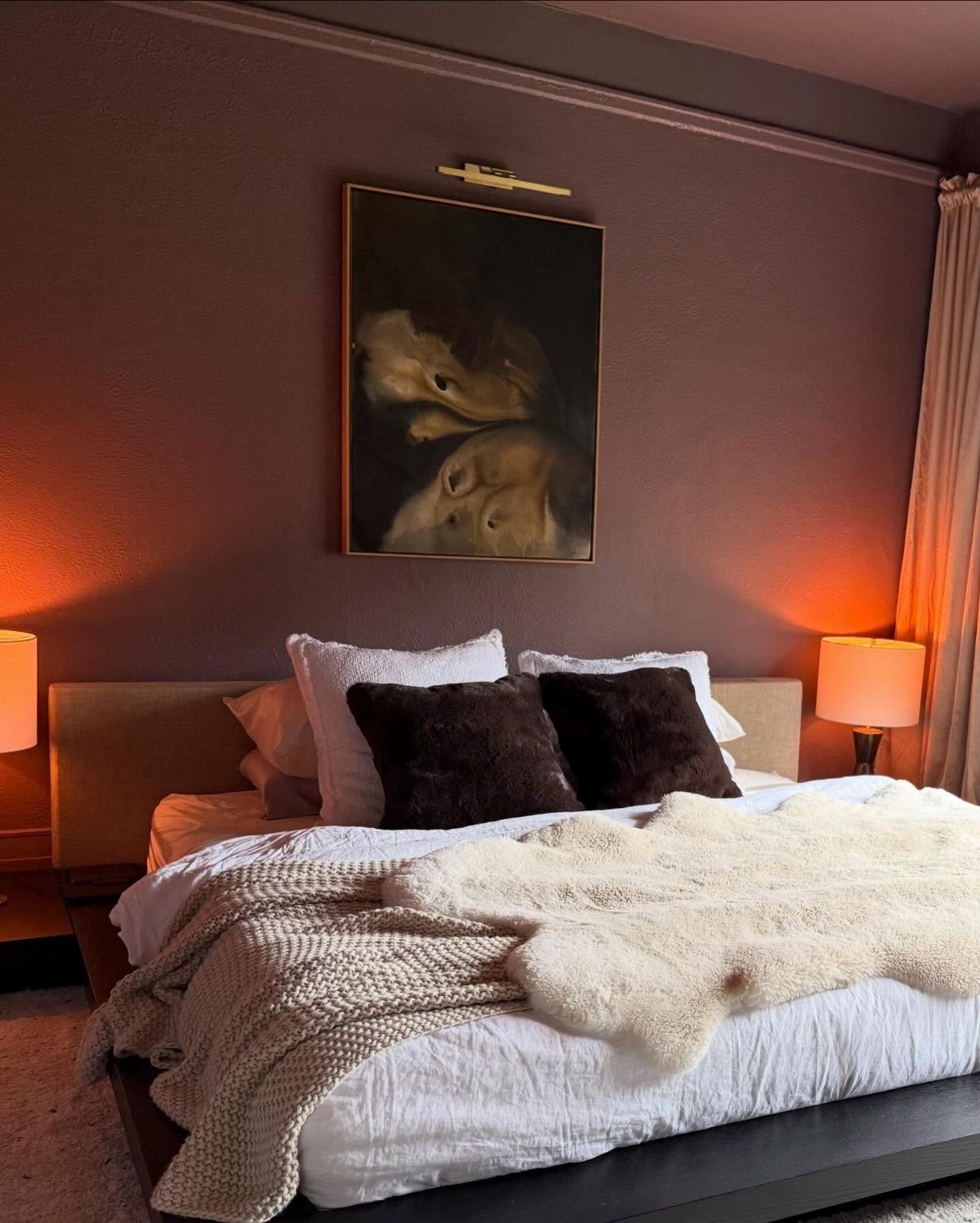
Mauve sits between gray and purple, which is why it feels calm instead of sweet.
Mauve reads soft and a little cocooning, and it works best when the bedding stays in white or warm brown so the wall does the talking.
A faux-fur throw adds texture that suits the muted color, and a framed painting over the headboard gives the wall a focal point.
I’d pick a mauve with a gray undertone for a bedroom, then paint a sample patch and check it at night before buying gallons.
8. Very Black Ceiling and Walls
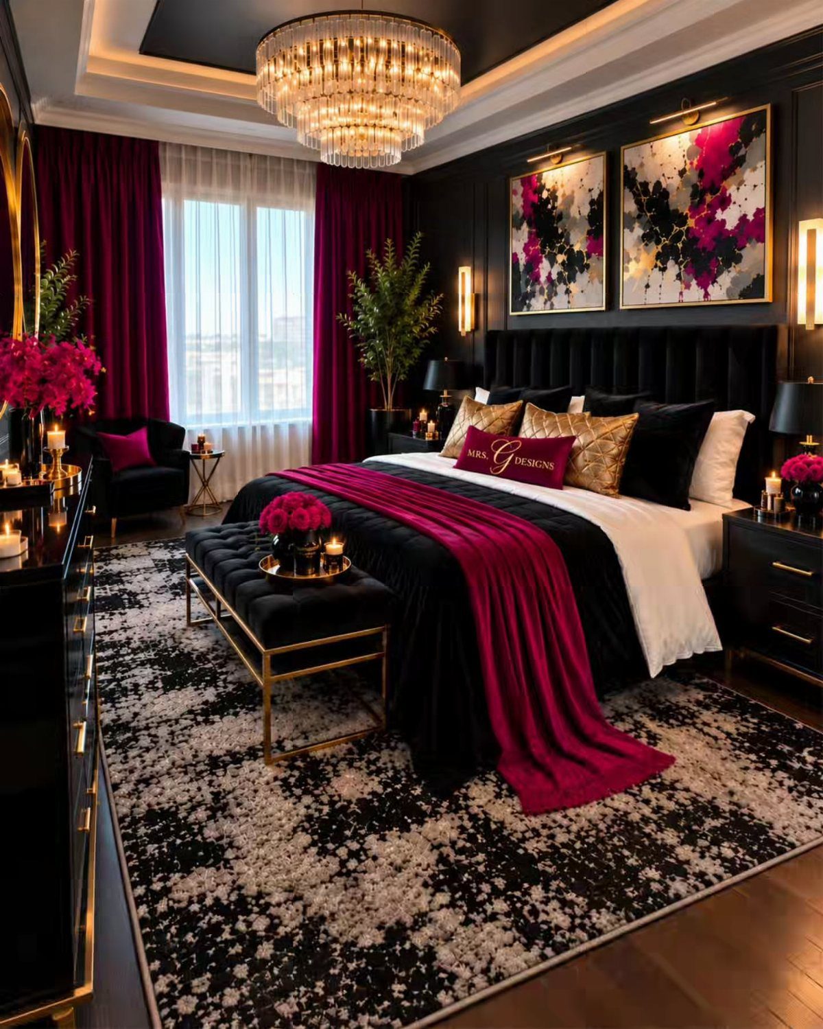
Painting the walls and ceiling the same black closes the corners of the room, so the box seems to disappear and the bed becomes the focus.
Ralph Lauren’s Surrey is the paint used here, a good name to check if you want this look.
A crystal chandelier gives the black something to reflect, and magenta accents keep it from feeling heavy. A patterned rug in black and white breaks up the floor.
Expect to need extra coats on a ceiling this dark, so plan more than one weekend afternoon.
9. Charcoal Gray

Charcoal gray is the moody option that still behaves like a neutral. Dark curtains and a gray bed deepen it, and a white rug stops the room from turning into a cave.
I’d add one textured piece, like a wall panel with black metal art, so the flat color has something to play against. Quilted bedding does similar work for less money.
Pick a charcoal with no blue or brown pull, then test it beside your bedding before you commit.
If you don’t want to repaint your bedroom for a while, cool gray is a neutral, versatile and timeless shade. It pairs with every home style, and provides freedom to mix and match decor.
10. White Walls
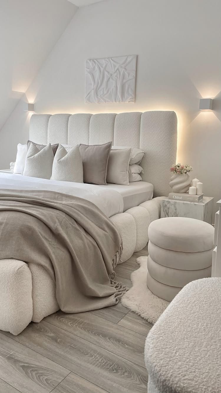
White walls ask the bedding to do the talking.
Keep the linens beige and the textures white, then layer with an ottoman and a small side table in the same quiet tones, so the room gains depth without picking up any color.
This is the cheapest paint job on the list, and the easiest to live with if you rent. I’d choose a white with a slight warmth, so beige bedding doesn’t look dingy beside it.
Texture matters more than pattern here: tufting, knit, linen.
11. Painted Ceiling
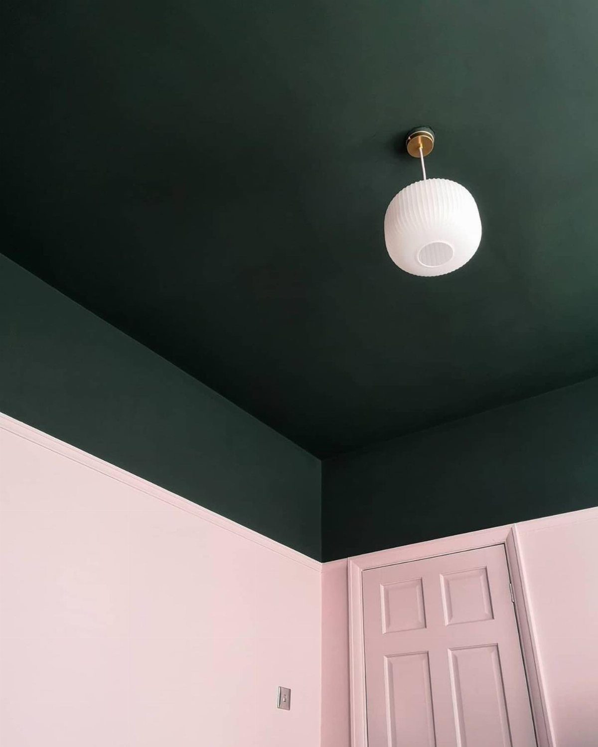
Carrying a deep green from the ceiling down onto the upper wall makes a room feel lower and snugger, and light pink on the lower walls keeps it from going dark.
A white door and white globe pendant stay clean against both.
For a weekend job, tape a firm line where the 2 colors meet.
I’d choose this over a full accent wall when the ceiling is plain and you want a bolder look.
12. Cream Paint
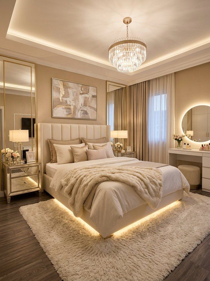
Cream is softer than white and warmer than beige, so it makes a glamorous room feel inviting instead of stiff.
Keep the rug plush and white so the walls stay the warmest thing in the room.
I’d choose a cream with a yellow undertone over a pink one, and test it beside your trim, since cream can look dull next to bright white.
13. Dusty Pink
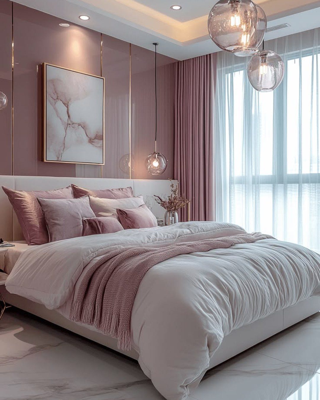
Dusty pink works as a soft neutral with a little warmth, which is why it suits a bedroom better than a candy pink. Keep the bedding white with pink accents, and let gold in the lighting do the glow.
I’d pick a pink with a gray undertone so it reads grown-up.
Hold a painted sample card or a patch on the wall next to your actual sheets and duvet in both morning and evening light before you commit to a full gallon.
14. Bold Accent Wall
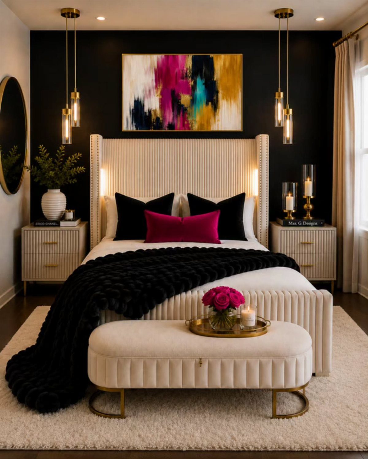
A black accent wall at the head of the bed gives the room a focal point without making the whole space feel dark.
Cream furniture keeps the contrast sharp, and one piece of colorful art stops the black from feeling flat.
I’d paint only the wall behind the headboard, since it’s the one the eye lands on first.
15. Two-Toned Walls
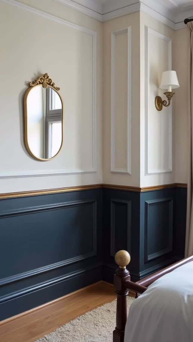
Cream above and dark blue below splits the wall into 2 zones, and a gold trim line at the join makes the split look planned.
The maker of this corner added beading to build subtle traditional paneling, which is a smart way to give the lower color a real edge.
For a weekend job, paint the dark blue first, then tape a firm line before the cream goes on. I’d keep the lower section to about a third of the wall height so the room doesn’t feel heavy.
16. Colorful Patterns

Patterned bedding is easiest to live with when the walls carry a strong, simple color, and dark blue does that here. A painted ceiling in orange adds a second color without needing more furniture.
Pick one pattern to lead, then repeat its colors in the art and curtains so nothing competes. If bold feels like too much, start with the bedding and one painted wall, then add from there.
17. Lime Plaster
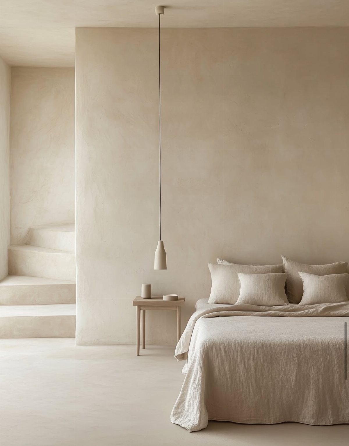
Lime plaster turns a plain beige wall into something with depth, because its surface shifts in the light instead of sitting flat like standard paint.
It costs more and takes more skill than rolling on paint, so I’d try it on a single wall first. A beige, warm tone suits renters least, since it can’t be undone with a quick recoat.
18. Roman Clay
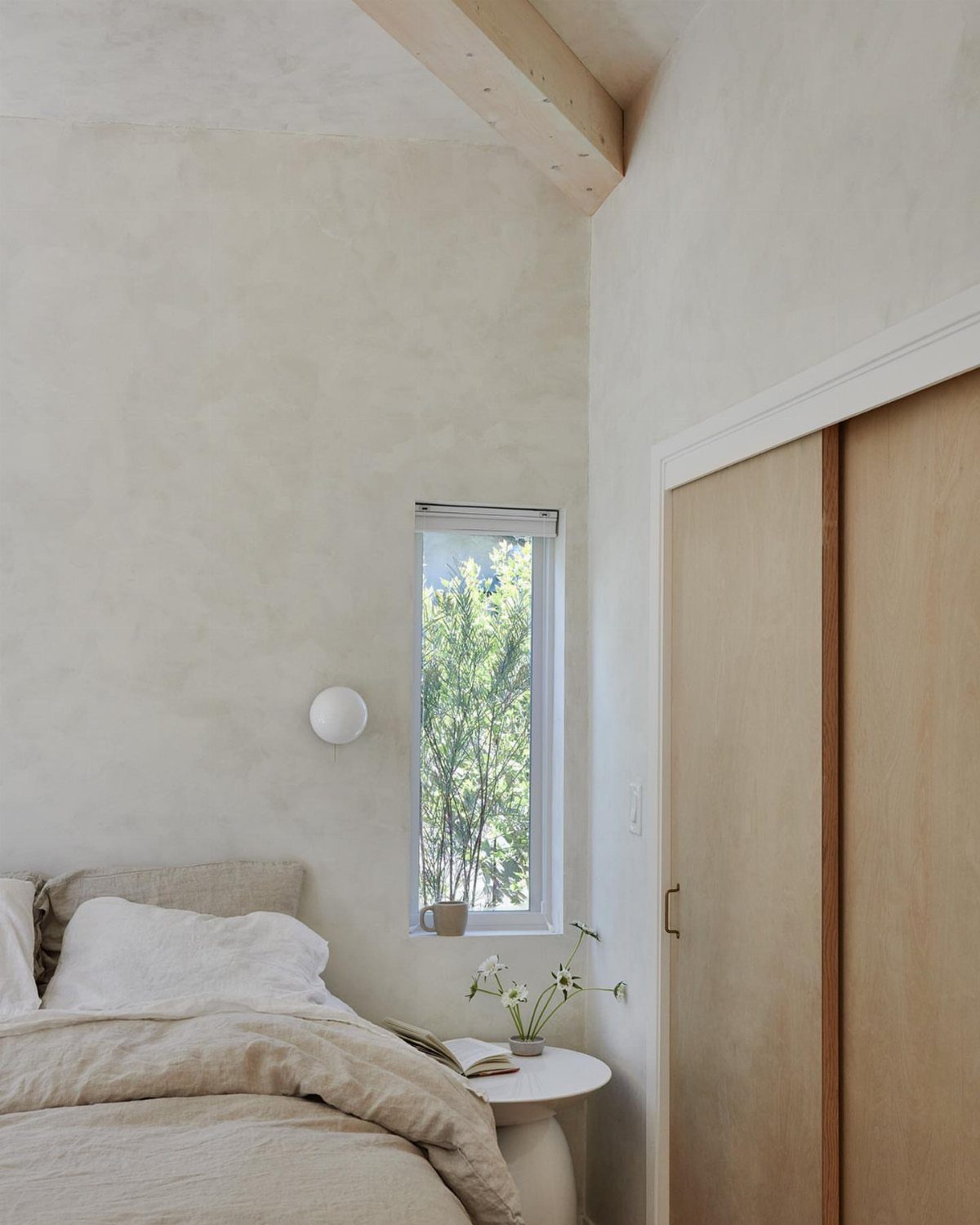
Roman clay gives off-white walls a soft, cloudy texture, so a plain bedroom still has depth. Beige linens and light wood stay quiet against it, and a vase of flowers is plenty of decor.
I’d choose it for a room with one good window, since side light shows the texture best. Practice your trowel strokes on a board before touching the wall, and expect it to take more than one weekend afternoon.
19. Dark Purple Walls
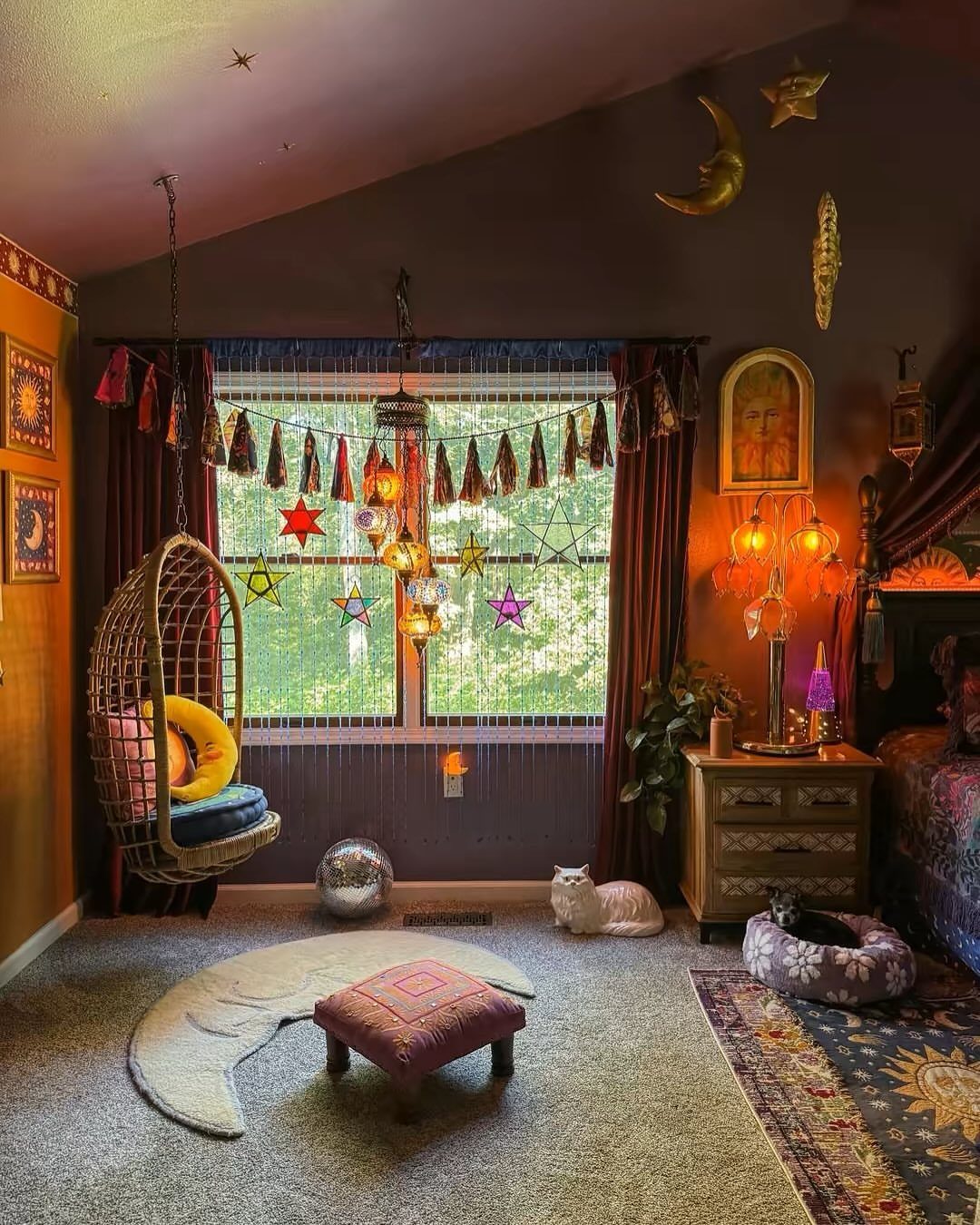
Dark purple walls suit a bohemian bedroom because the deep color makes gold and silver pieces glow, so a disco ball and a crescent moon rug feel like part of one scheme.
I’d keep the rug and decor in cream, gold or silver so the purple stays the main color. Sample a patch beside your bedding and check it at night, since lamplight pulls dark purple toward black.
Choosing the Right Color
Before you pick a swatch, look hard at the room: where the light comes from, what the floor is, and how big the walls are.
The same shade looks different depending on how much daylight comes in, which direction the windows face, and even what’s outside them, like a brick wall or a big tree.
In a bright room, a pale gray can pick up hidden blue or lavender undertones, and cooler shades show it most. Check for that before you buy.
Floors matter too. Walls a shade or two lighter than the floor tend to look settled and natural, so use the flooring as your anchor.
Windows, lamps and ceiling fixtures each tint a color differently, so count them and note which ones you’ll switch on in the evening.
Warm bulbs make vivid, bold colors easier to live with at night, so pick your bulbs with the paint in mind.
Last, decide the mood. Soft, warm colors feel cozy, cool hues feel calm yet fresh, and deeply saturated colors energize and wrap the room around you.
Testing Paint Colors
Order sample pots or chips instead of trusting the chip in the store. However much a color wins you over in the store, it only counts once it’s on your own walls.
Set the test up the way you actually use the room. Paint patches on more than one wall, since each wall gets different light, and leave them up for a few days.
Look at them at sunrise, midday and sunset, then again at night with your lamps on. Natural light shifts through the day, and your bedroom bulbs add a second change on top of it.
Hold the sample near your floor, bedding and furniture while you look. A color that seems right alone can clash once the real pieces sit beside it.
Impact of Color on Mood
Match the color to what you want from the room.
If you need a spark in the morning, go deeper and more saturated. If you want a cocoon, choose soft, warm tones.
For pure calm, cool hues like baby blue, navy and hunter green work well, and blue and green both carry a natural, restful feel. Neutrals, off-white and soft gray are the safest picks for a tranquil bedroom.
Guest rooms deserve the same logic. Balanced, relaxed hues welcome people whether they stay one night or a week.
Frequently Asked Questions
What is the most popular paint color for bedrooms?
Soft blues and soft neutrals like warm white, cream and beige are the usual favorites, since they read calm and restful.
Popularity shouldn’t be the deciding factor, though. Pick a shade that suits your light, floor and bedding, and test it on your own wall first.
What are the trendy bedroom paint colors for 2026?
Earthy tones and muted pastels are expected to trend. Dusty pink is a good example: it acts like a soft neutral with a little warmth.
A sage or dusty green with a touch of gray in it looks calmer and more adult than a clean, bright one, which can drift toward nursery pastel.
What are the golden rules for bedroom design?
Before picking anything, look at the room: which direction the windows face, what the flooring is made of and how much wall space you have to cover.
Once you’ve narrowed down your bedroom paint colors, test sample patches on more than one wall for a few days, checking them at sunrise, midday, sunset and at night under your lamps.
Tape the swatch next to your comforter, nightstands and curtains before you buy a gallon, since a shade that looks perfect on its own can fight the pieces already in the room.